Cache
A moodboard tool for the low-stakes moments — when arranging a few references doesn't need a whole design file behind it. Paste anything — an image, a link, a PDF — and it's already on the board. No account, no "create new project" dialog, no auto layout to fight with.
Moodboards, before there was a product
Cache didn't start as a product idea. It started as a habit I already had — I've been making moodboards since I was a kid, long before I had a name for what that was. Project planning, visual intelligence, brainstorming, mapping out a feeling before I can explain it in words — it's always run through images first. That's not backstory for the case study. It's the actual point of origin.
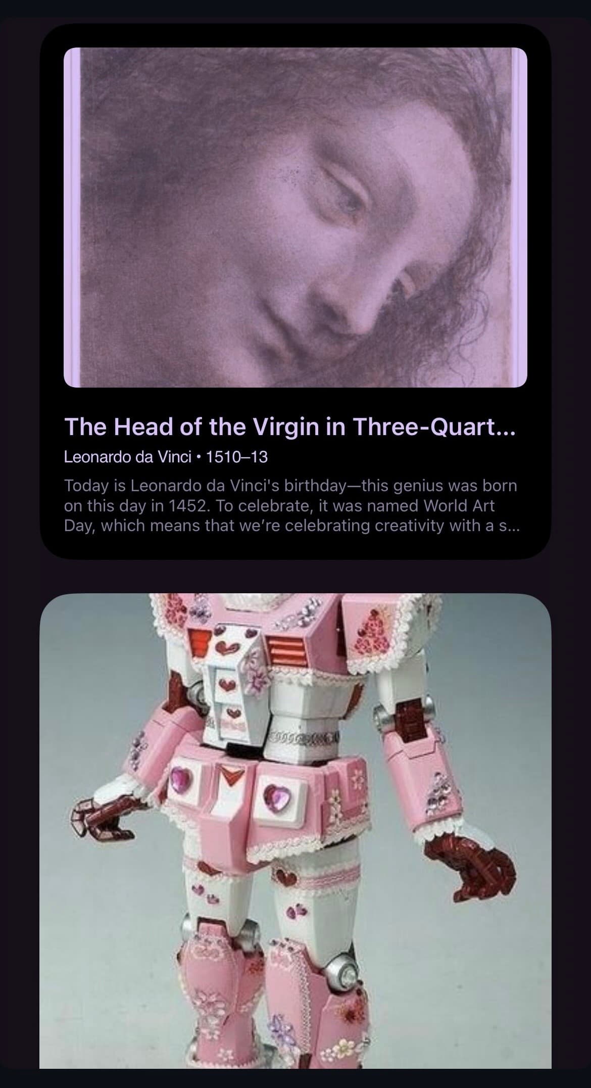
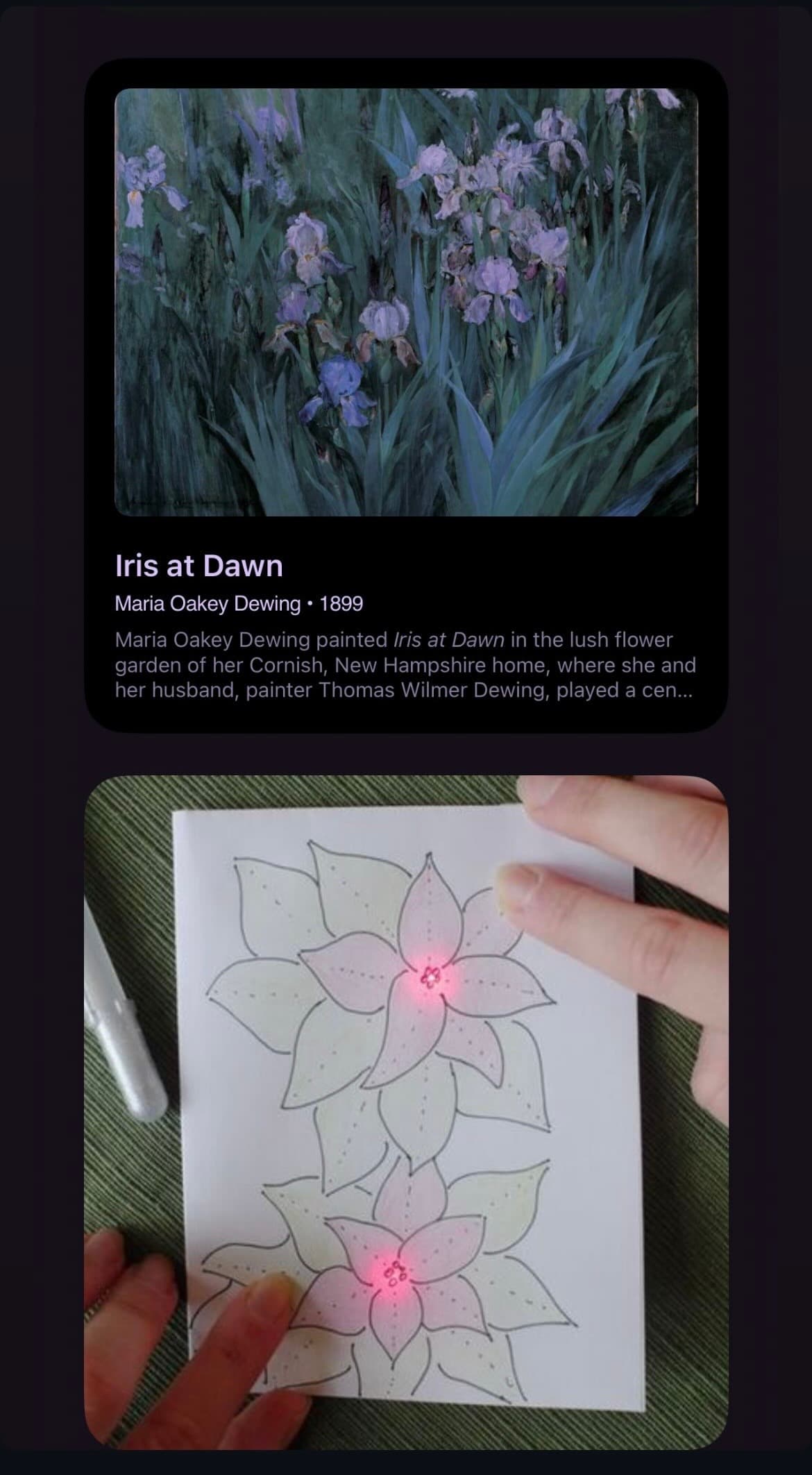
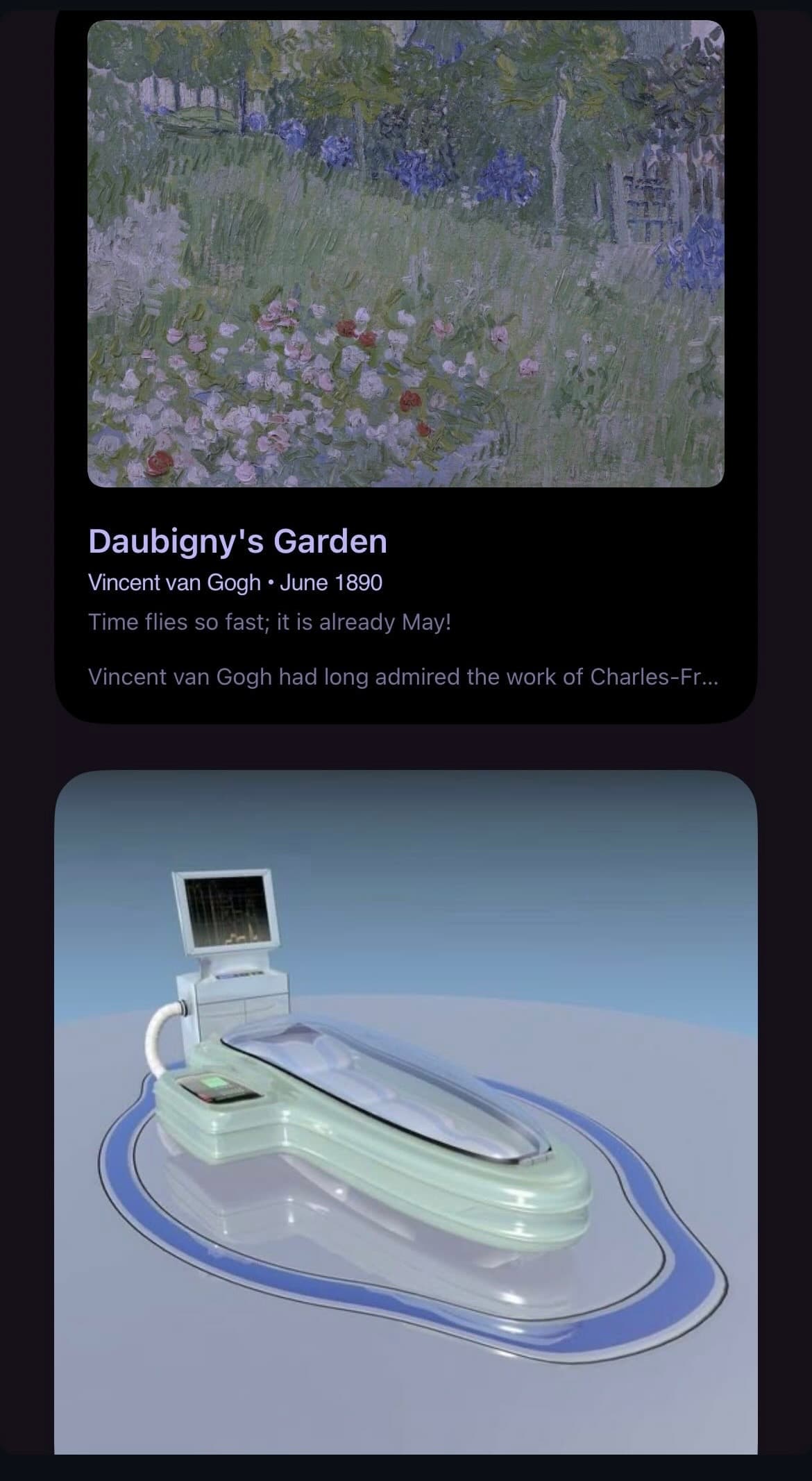
The clearest version of that habit today lives on my phone, not in any design tool. I keep two widgets on my homescreen — a daily art widget and Pinterest — and every so often they land on the same feeling without knowing about each other. When that happens I screenshot it. I've been calling that parallel universes: two feeds that share no data, no algorithm, no curator in common, occasionally agreeing anyway.
Not a curated pairing — an accidental one. The daily art widget doesn't know what's on my Pinterest boards, Pinterest doesn't know what painting loaded that morning. When the two rhyme anyway — same palette, same shape logic, same mood coming from two completely unrelated places — that's the moment worth keeping. It's evidence that the thing I'm drawn to is a real pattern, not a mood I talked myself into.
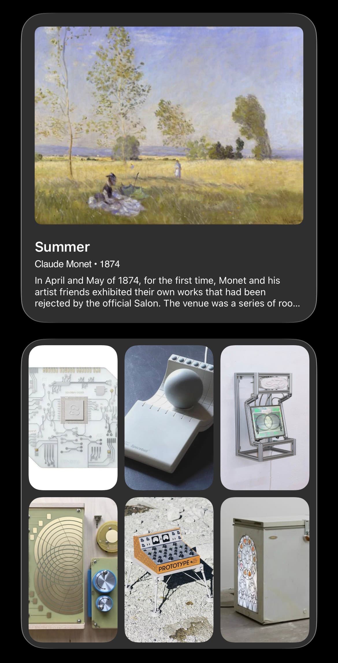

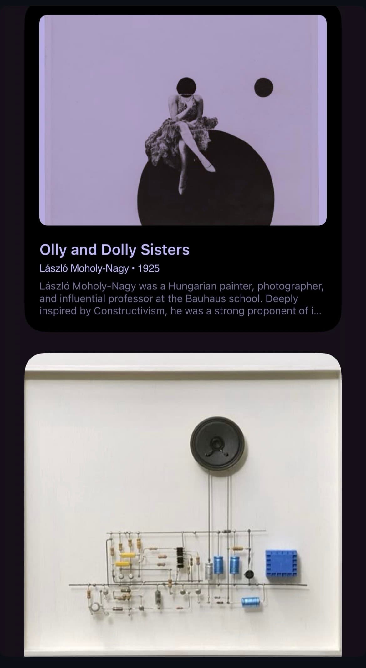
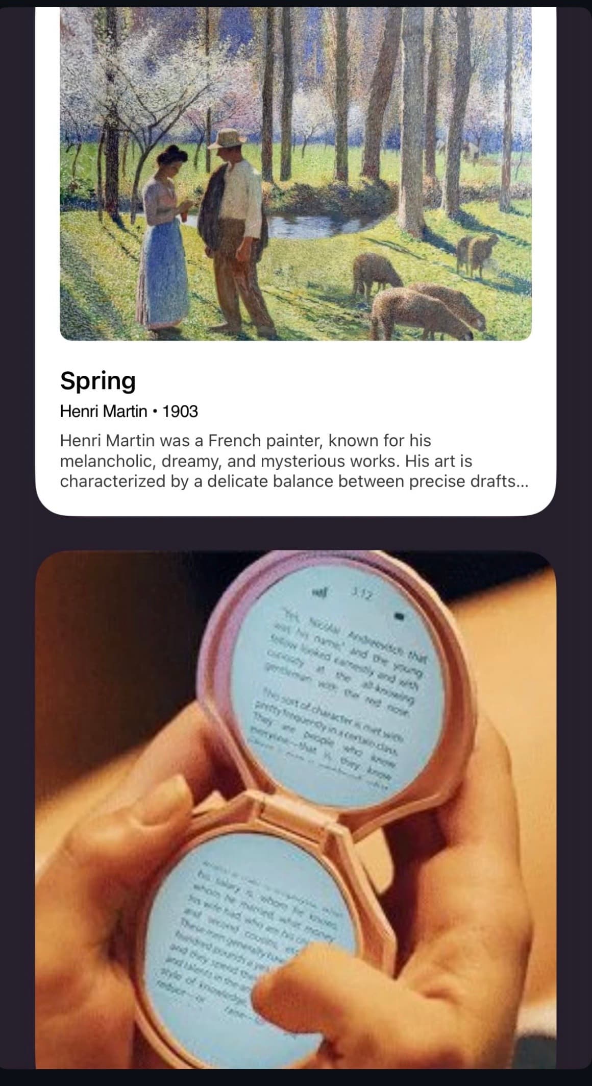
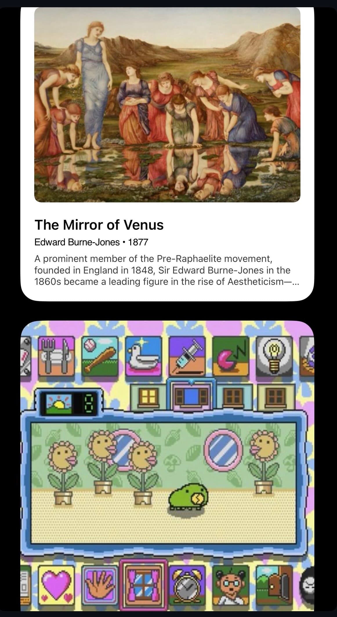
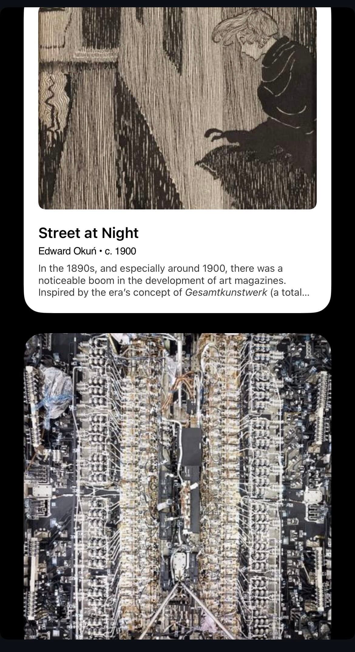
Look at the first pairing above and the correlation isn't subtle: Monet's Summer — soft yellow field, muted sky, a figure half-sunk into the grass — sitting right next to a saved grid of a bare circuit board, a Spaceball input device, sculptural instrument panels, a green synth-looking control box, a "prototype" object shot on cracked concrete. Different centuries, different mediums, same instinct underneath: worn, warm, slightly obsolete things, shot plainly, without irony. That instinct is exactly what Electrocute Lab is built on, and Cache is the tool I built to actually act on it fast.
This is also, honestly, the gap in Cache today. The paste-first workflow is built for the moment I'm actively assembling something — pulling references onto one patch, on purpose. The parallel universes habit is the opposite motion: passive, noticed in the moment, on a phone, with no board open at all. Right now that half still lives in screenshots and text threads — the grid above is a running collection, not a one-off, and it'll keep growing as new ones get caught. More on what closing that gap could look like in the roadmap below.
Moodboards aren't the killer feature
Don't get me wrong — Figma is my main design tool, I genuinely love it. But there's a specific moment where it's the wrong tool for the job: I just want to drag a few references together, low stakes, nothing structural, and opening a full design file for that is like using a table saw to cut a piece of tape. The actual want underneath that is simple: collect things fast, arrange them loosely, move on.
The reframe that made the product make sense: it's not a moodboard tool, it's a room. A moodboard implies a finished artifact you're building toward. A room is a space you keep walking back into. So the entry point isn't "create a new board" — it's opening the app to nothing, hitting cmd+v, and it's just there.
Most tools in this space pick a side: dead simple with almost no styling control, or fully styleable but heavier to open than a quick reference-drop deserves. Cache is trying to hold paste-anything simplicity and real, Figma-grade styling control at the same time — that combination is the actual gap, and it's the reason this kept going past the point of "just for me."
The happy path
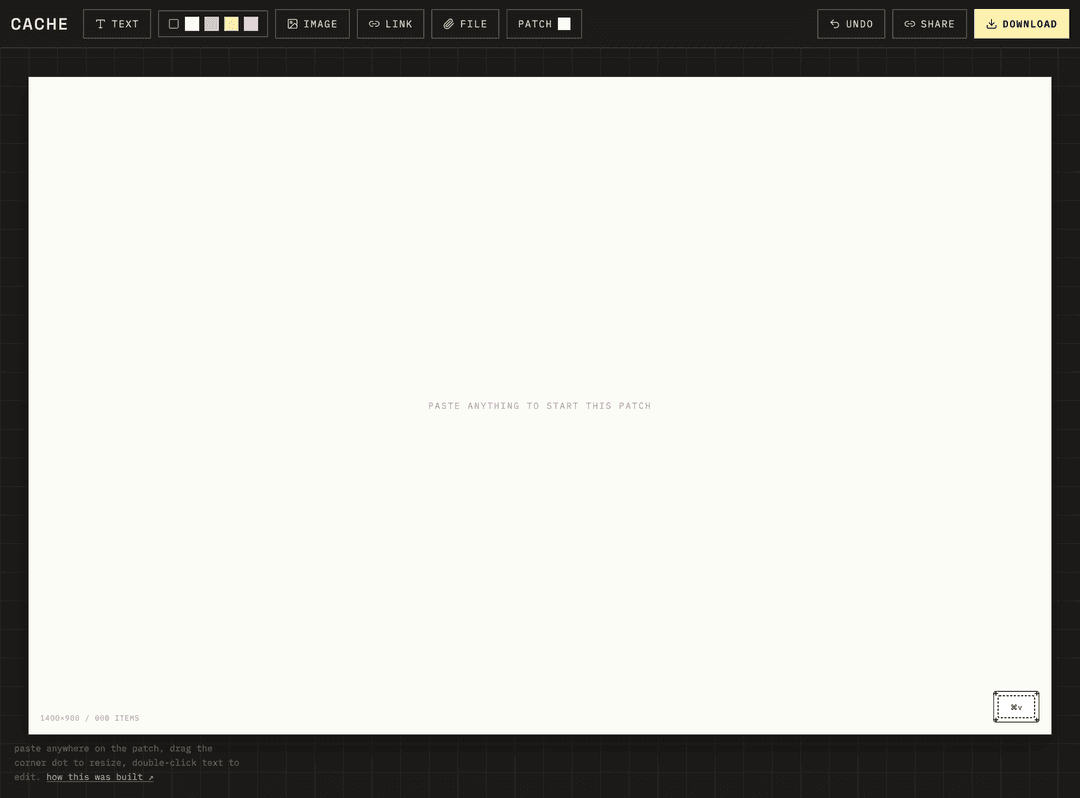
Not a click-through wireframe deck — this is the actual working app. Every step below is something you can do right now on the live link.
No landing page, no "new project" button. Copy any image or a URL and hit cmd+v directly on the patch — it appears immediately as a card.
Drag to move, drag the corner dot to resize, double-click text to edit. Select a piece and a style panel floats in — it isn't a permanent sidebar, so the patch keeps the full page to itself until something's actually selected. Fill color uses a custom in-app picker instead of the browser's native color dialog; text pieces get a font picker (six presets plus your own uploaded font file); every piece gets corner radius, rotation, opacity, and layer order.
Paste a raw URL and it unfurls into a real card (title, preview image, domain) via a small server route. Drop a PDF and it becomes an openable file card — both get an explicit "open" button so opening them never fights with dragging them.
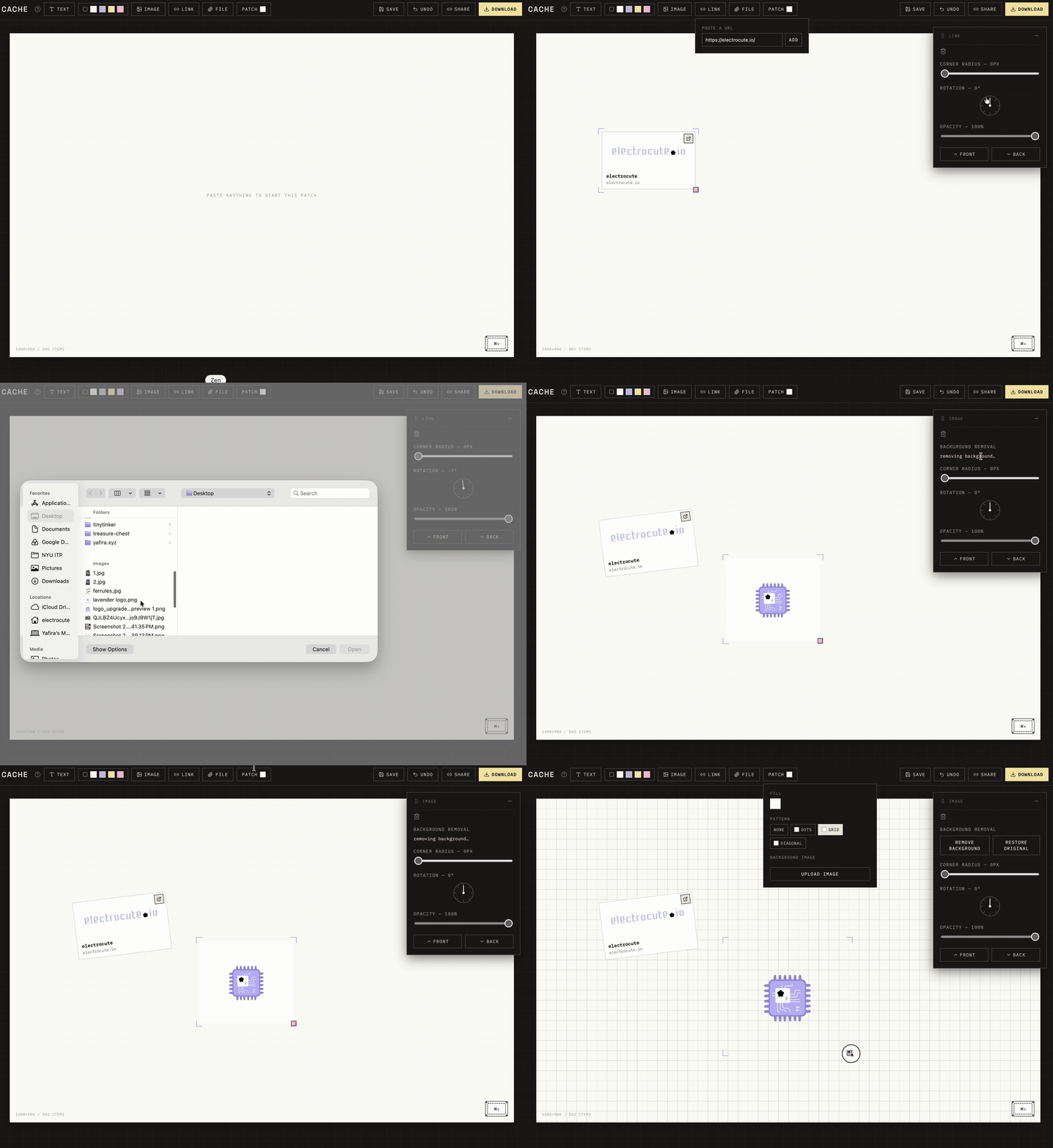
Cmd/ctrl+z steps back through a real history (one undo per gesture, not per pixel). Delete/backspace removes the selected piece. Export as PNG, a self-contained HTML file (links and files stay genuinely clickable), or PDF (with real clickable link annotations, not just a flat picture).
Where it sits
This space is more crowded than it looks from the outside. Are.na, Cosmos, Milanote, mymind, PureRef, and Figma's own FigJam are all circling the same territory — "visual, freeform, collect-anything." Most of the obvious wedges are already taken.
The gap that was actually open: paste-anything simplicity + real, Figma-grade styling control, held at the same time. Plenty of tools nail one side of that or the other — dead simple to start but little to no control over how things look, or fully styleable but heavier to open than the task deserves. This is trying to hold both at once.
| Tool | Is for |
|---|---|
| Discovery | |
| Are.na | Archives |
| Cosmos | Collecting |
| Milanote | Planning |
| Figma / FigJam | Collaboration |
| Cache | Personal visual thinking — paste in, style it, done |
Patches, stashes, cached
Every tool in this category names its unit of work differently — Figma has files, Are.na has channels, Notion has pages, Cosmos has clusters. Picking a vocabulary on purpose, instead of defaulting to "board" and "save," was worth the extra round of naming work.
The product name went through a real shortlist first — found gems, swatch, patch, trinket — before landing on cache: short, and it does double duty as both "a stash of something valuable" and literally what a computer does to store things for fast retrieval. That it also folded neatly into "cached" as the save-state verb was a bonus, not the plan.
The computer-science meaning isn't just a pun sitting on top of the name, either. A real cache is a small, fast store that sits between you and the thing you actually want, so the next time you reach for it, it's already close at hand instead of being re-fetched from wherever it originally lived. A patch works the same way — the references you just pulled together stay right where you left them, arranged, instead of needing to be found again each time you want to look at them together.
There's a well-known line in computer science: there are only two hard problems — cache invalidation and naming things. This project ran straight into the second one, directly above. It mostly dodges the first — nothing in a patch needs to expire or get evicted the way a real cache does. The detail worth keeping, though: "cache" comes from the French cacher, to hide. The actual visual identity here does the opposite on purpose — a blank tag instead of a hidden logo. The name kept its function and inverted its origin.
Three passes to get here
The first pass leaned into my usual pastel poetronics palette — blush, matcha, wisteria, running-stitch borders. It looked fine and it looked like every other craft-adjacent tool in the space, Cache included. The second pass just turned the saturation up. Also fine, also still generic.
The direction that actually stuck came from naming references outside the usual moodboard aesthetic entirely: Dieter Rams, for the belief that color and ornament should only show up where they're doing real work, not decorating it — and Margiela, for treating the absence of a logo as the identity itself. Translating that kind of restraint into actual interface decisions, instead of quoting either one literally, is what got this away from looking like every other tool in the category.
Two details carry most of the identity now. Selection is a viewfinder-bracket mark instead of a soft dashed outline — sharp, technical, doubles as a pattern-cutting crop-mark reference. And every patch carries a small blank tag in the corner, standing in for a logo the way Margiela's four-stitch blank tag stands in for one — deliberately arbitrary, so it never reads as a version number or a real system.
The screen, at full fidelity
The moodboard behind this direction was built inside Cache itself — pasting in product shots, the Margiela tag, and instrument-panel references directly onto a patch, rather than moodboarding this in Figma. Partly to stay consistent with what the tool is actually for, partly because there's no better way to show a paste-first tool's taste than to use it that way.
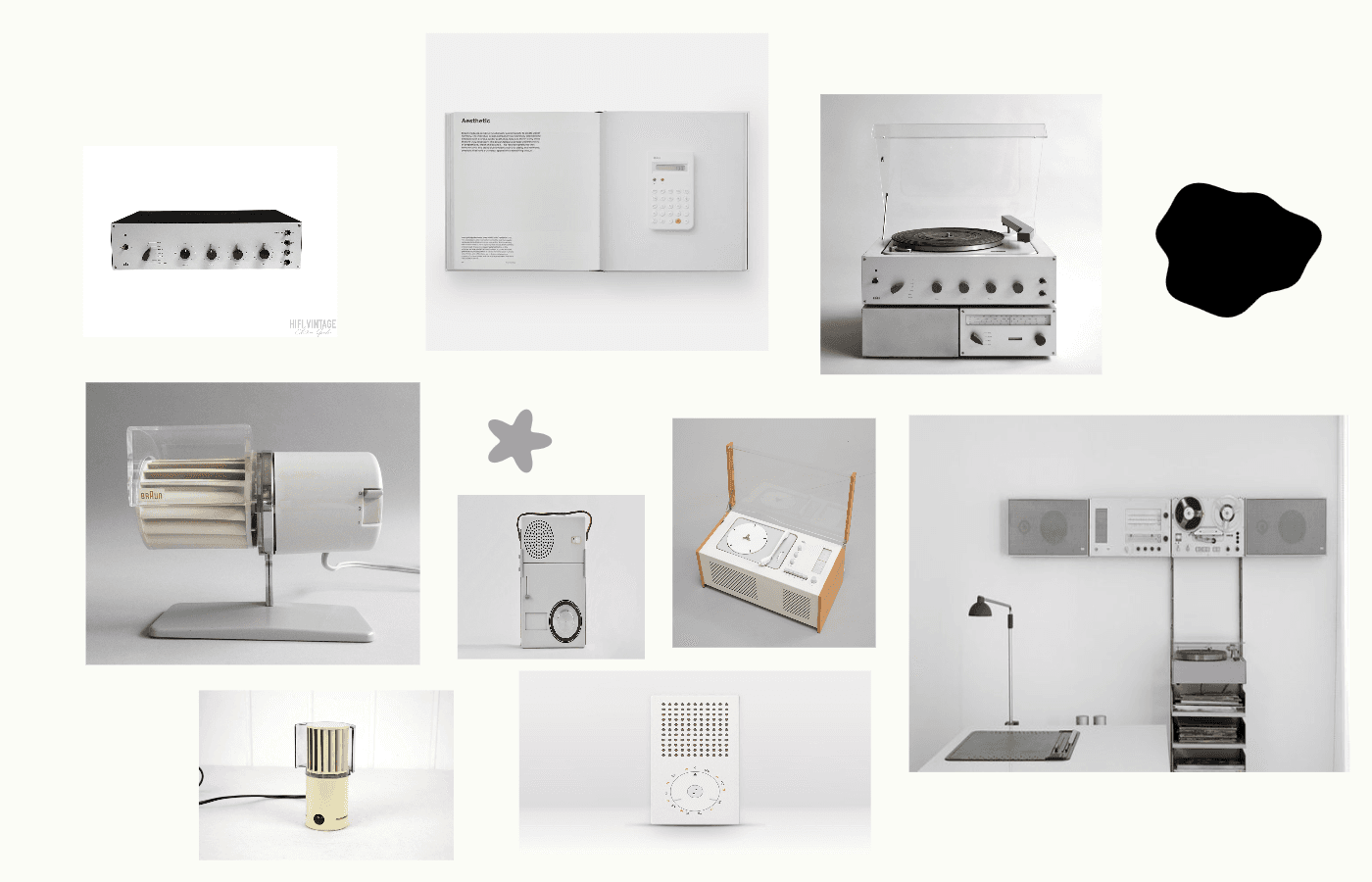
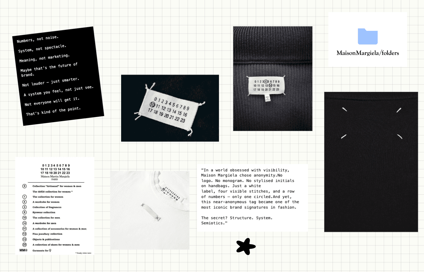
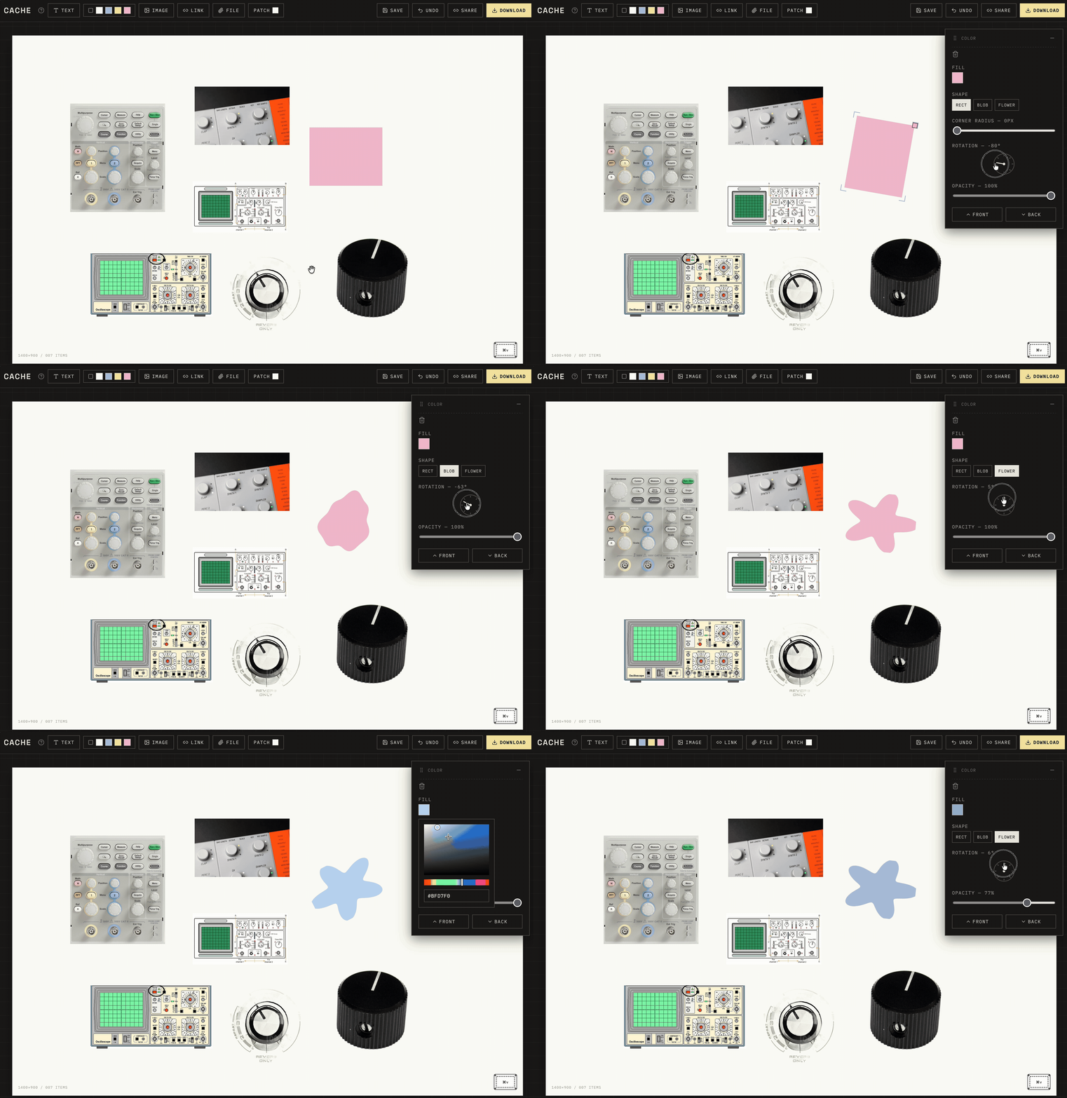
(Yes — this moodboard was made entirely inside Cache. Paste, arrange, export! :))
What actually broke, and why
A case study that only shows the final state skips the part that's actually evidence of how someone builds. Four real ones, in the order they surfaced — including one that took three wrong guesses before the actual fix.
The style panel's component was defined inside the parent component's function body. Every slider onChange triggered a re-render, which gave React a brand-new component identity, which tore down and rebuilt the whole panel — including the native range input — mid-drag. The browser's own drag tracking never survived a single tick.
Moving it to module scope with explicit props fixed it structurally — not a CSS fix, not a browser quirk, an actual React anti-pattern with a specific name.
They weren't stuck — every pasted image landed at the exact same board-center coordinates, with zero offset. A second paste stacked precisely on top of the first, so any card you dragged away just got covered again by the next paste landing in that same spot. The fix was a cascading offset shared across paste, text-add, and color-block-add, so nothing spawns exactly on top of anything else.
Link cards fetch a preview image from whatever site got pasted. Drawing an external, cross-origin image onto a canvas without the right handling "taints" the canvas — the whole export throws a security error, not just that one card. Setting img.crossOrigin = "anonymous" up front means a source without proper CORS headers just fails to load cleanly (falls back to a blank card) instead of silently poisoning the entire download.
First guess: the library needs SharedArrayBuffer, which needs two response headers to cross-origin-isolate the page. Added them, verified they actually landed with curl -I against a real production server. No change.
Second guess, and a real bug this time: every image here is a data: URL, and the library's own check for "is this an absolute path" uses a regex requiring // right after the scheme — matches http://, not data:. It was reading every pasted image as a relative path and mangling it. Found by installing the exact package version locally and grepping its source for every .replace() call until the actual line turned up. Fixed it by converting to a blob first. The exact same error came back anyway.
The real one: the crash was inside a different library entirely — onnxruntime-web, the ML runtime behind background removal — in a function called RelativeURL, trying to locate its own wasm file. Webpack was rewriting that function's internal import.meta.url reference into something that isn't a plain string anymore, and the library's own url-building code broke on it. That's exactly the subsystem the library's own docs warn about: "currently only Next.js 15 is supported." This was running on 14.
The fix, after upgrading: load the library from a CDN URL with a webpackIgnore comment instead of importing it locally. Webpack never touches a webpack-ignored import, so it never rewrites anything inside it — the bug simply has nothing left to attach to.
What's built, what's roadmap
/api/unfurl) fetches og:title/og:image server-side — the one place this "no backend" app actually needs a sliver of one, since a browser can't fetch an arbitrary third-party page directly.next/font/google, plus custom font upload (woff/woff2/ttf/otf) injected as real @font-face rules. Canvas exports call document.fonts.load() before drawing so the export always matches what's on screen.The honest roadmap
Not yet built, on purpose: selecting an arbitrary subset of pieces — right now selection is all-or-one (select-all, or click a single piece), with no shift-click or rubber-band way to grab just three specific pieces out of ten. Also missing: live group-dragging — a full selection can be copied and pasted back as a group, keeping every piece's position relative to the others, but there's no way yet to grab several selected pieces and drag them together with the mouse in real time; dragging still only ever moves one piece. Beyond that: stashes, the folder layer above a single patch, once the core loop has been used by more than one person; connections and flows between pieces, which stay explicitly out of scope until the basic loop is proven; and moving sharing off the URL hash and onto real storage once boards start carrying real files.
The desktop app is built for the moment you're actively assembling a patch. It's not built for the moment described in section 01 — spotting a rhyme between two things you weren't even looking for a rhyme between, on your phone, with no board open. That's a different interaction shape entirely: not "open Cache, paste, arrange," but "screenshot two things, drop them next to each other, done" — closer to a share-sheet target than a full editor. No layout decisions, no styling panel, just two (or three) images landing side by side the instant you catch the correlation, so it's saved before the feeling passes. The patches it produces would be small and fast on purpose — the point is capturing the instinct, not composing a board.